Colour Blind Album Artwork
January 9, 2018
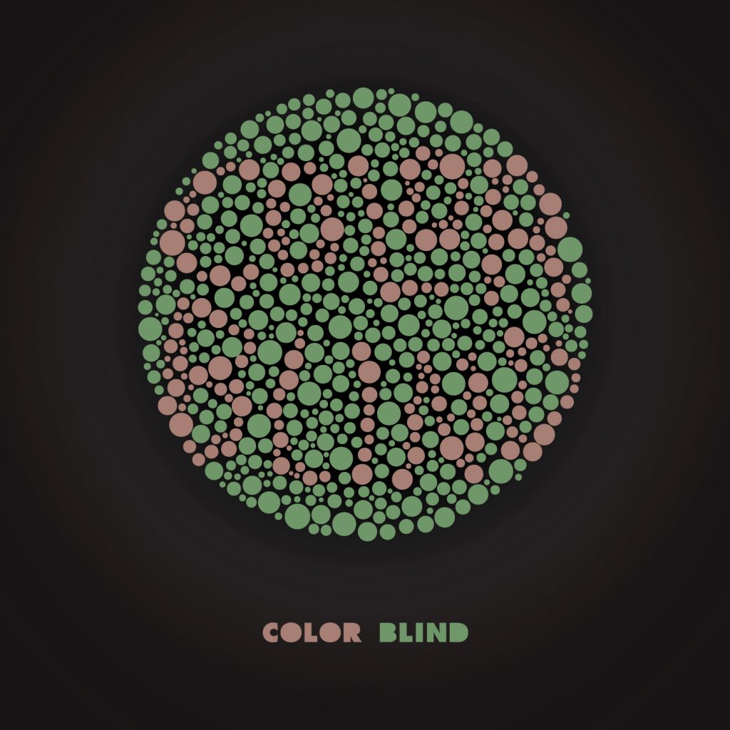
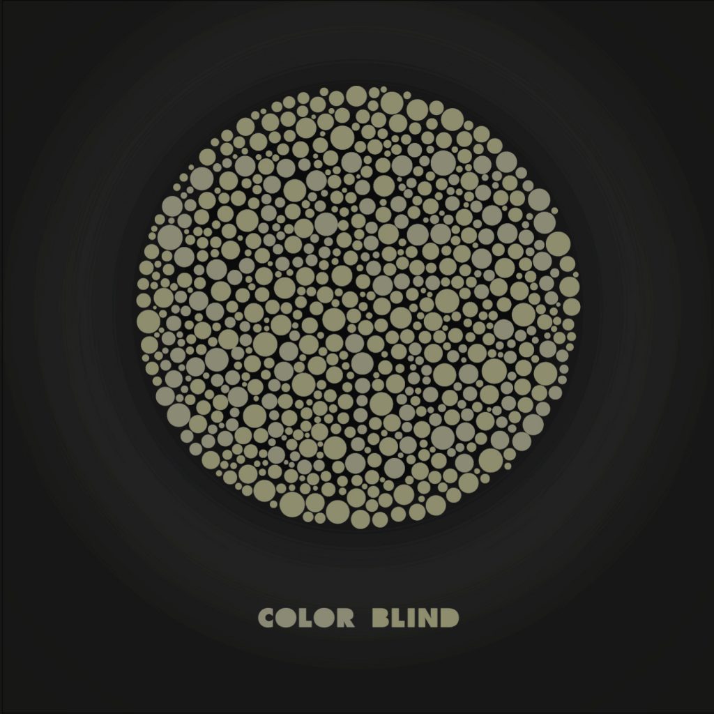
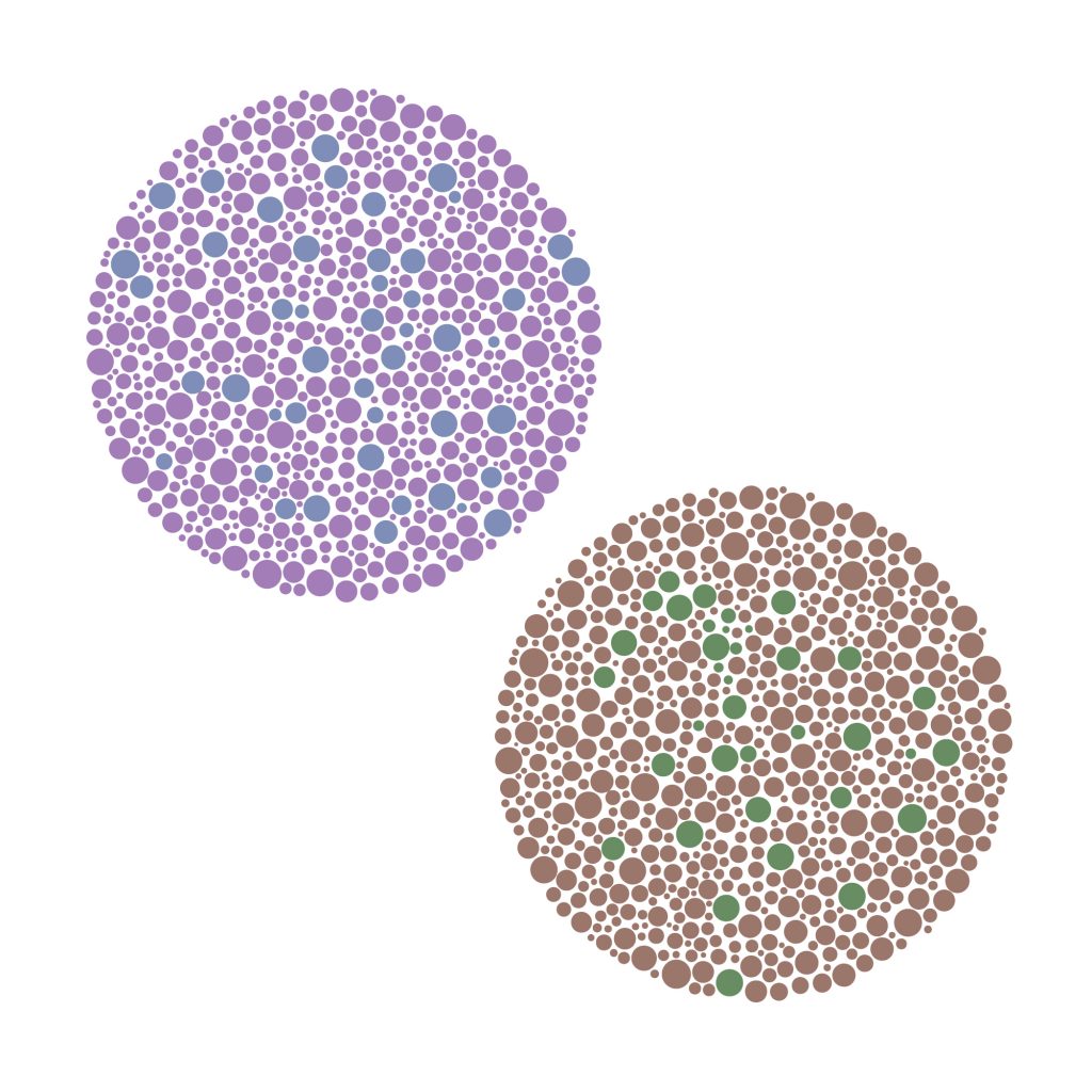
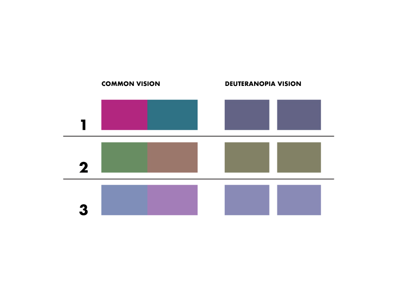
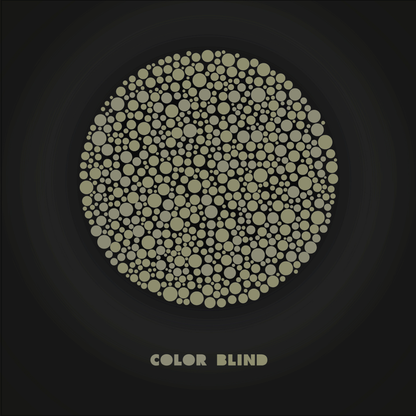
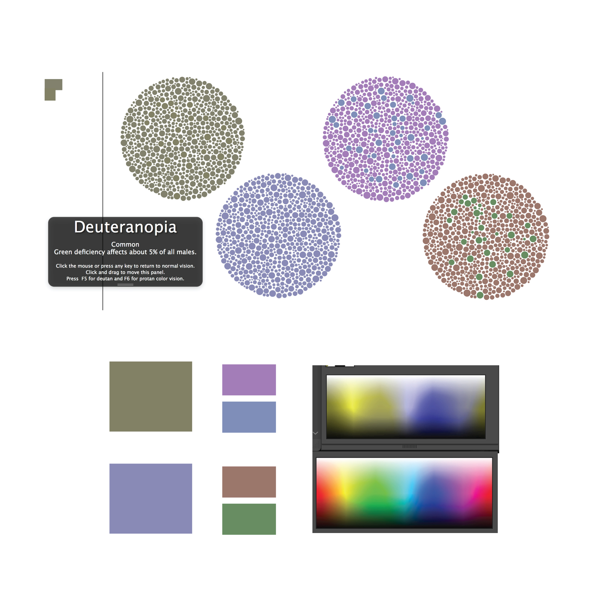
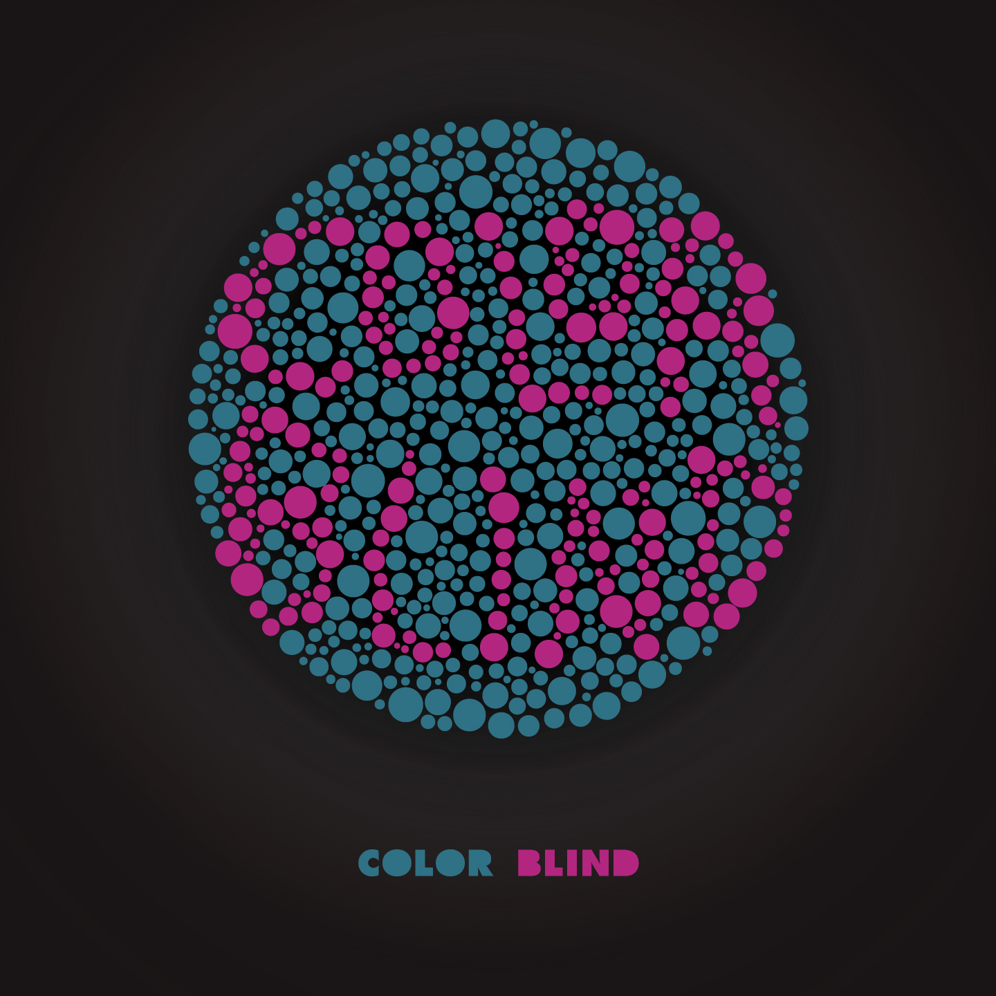
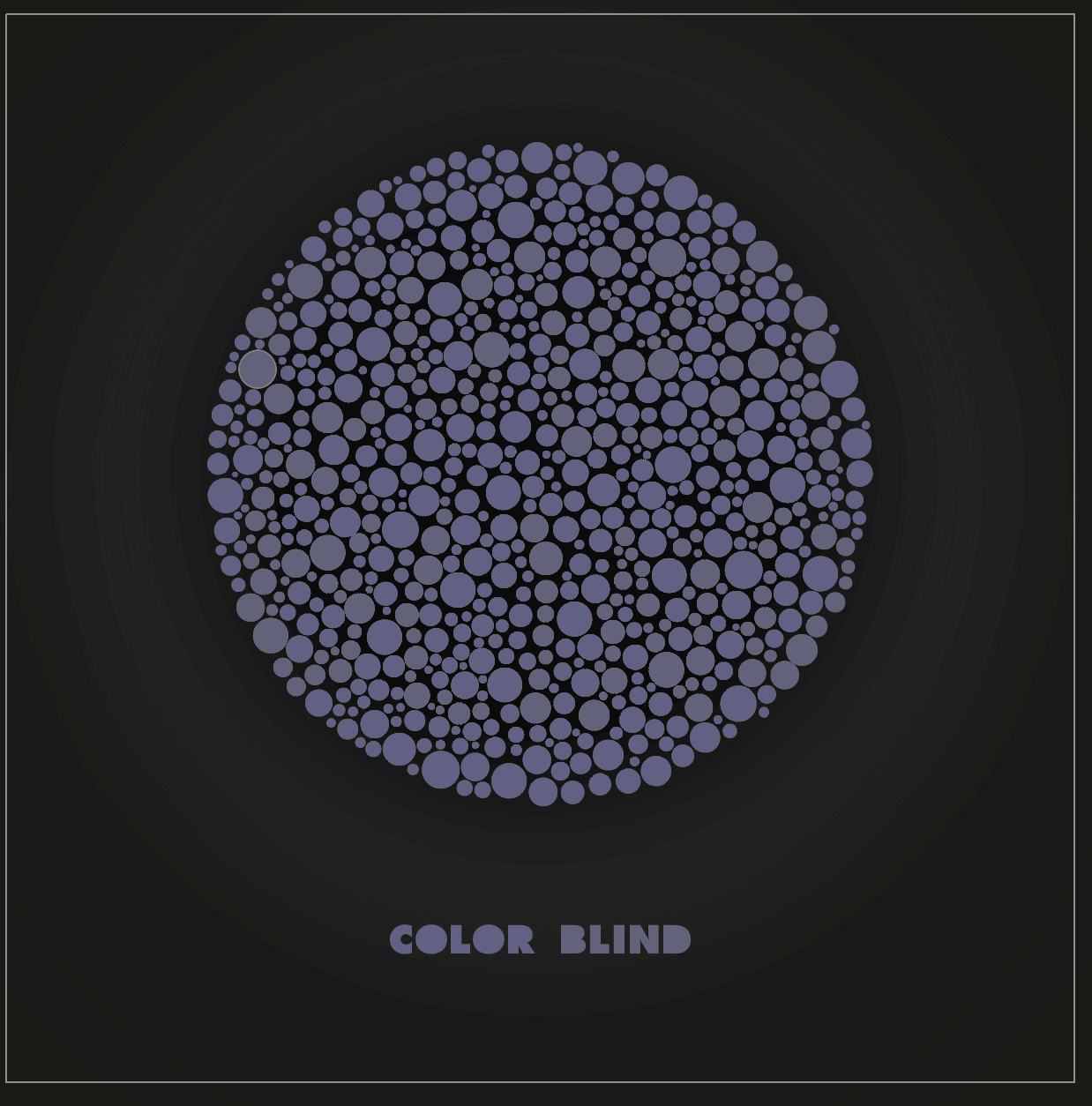
Here is an album cover I created for Max Trippenbach’s album, Color Blind(Soundcloud link). He approached me looking for some artwork to go on his Soundcloud account and this is what we came up with. I absolutely love his music so it made work on this a breeze. I decided to recreate a colour blindness test plate which would read “Color Blind”. This was done by working with numerous colours matches to find which worked best for this situation. Max has Deuteranopia which is pretty common, this type of colour blindness will cause reds and greens to merge together as well as other colour matches. A version with pink type and blue background had much more contrast and was easier to read but it was not chosen as the final. I have attached some of the colour research I did as well as showing what a user with colourblindness sees. Color Oracle is an excellent resource to help design with easy accessibility in mind.
Later on, I submitted this piece to Stefan Sagmeister during his design reviews on Instagram. It was great to have my work assessed by someone that I view so highly, I also enjoyed the feedback in the comments section. I learned a lot from the critiques, mainly being that I would have made the type more clear if given another shot. This was Stefan’s feedback.
“my review: I’ve seen this eye test numerous times applied to graphics projects, and while not new, your version does a good job. I would appreciate it more if the non-color blind person gets rewarded with something more interesting to read than the term ‘color blind’, even if its just the name of the band.” – Stefan Sagmeister